The phrase landing page gets tossed around a lot lately, and I’ve seen a lot of subpar pages around. Here’s a more in-depth look at what it means to build a good one for optimal user experience and greater ROI.
Get ahead of the game with our MSP marketing toolkit
First, what is an actual landing page?
A landing page is a specific type of web page designed to get you more leads. They tend to live outside your website and are not accessible through your site’s navigation menu. Usually, it presents an offer, whether it’s a piece of content or some consultation booking put forward as a marketing hook. They can be pushed through advertising, organic posts, within your blog, on your website, etc.
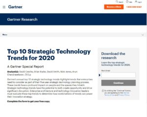
Those offers are usually gated behind a form. To access the content, a lead would need to fill the form and “pay” with his personal information to access it, thus populating your lead contact list. Sometimes, you can also have landing pages that don’t require any input and present an asset from the get-go, with no forms. Those are useful for ungated content, which usually revolves around brand awareness, and are used to deliver cookies out and power remarketing efforts.
It’s landing page building time!
1. Get rid of the menu
If you pay to have someone look at your content through advertising, you need to make sure they read it. To make that more likely, landing pages have very minimal actions possible in their interface. You typically get a logo, a title, a blurb about why they should be doing what you want them to do (i.e., download, book a meeting, call you, etc.), the form, and a light footer with your contact info. That’s it—no links to services, pages, about us, or the likes.
2. Optimize for speed
Just like you don’t want to lose them with too many calls to actions, you don’t want to have an overcrowded page with a ton of text and fancy-shmancy animations. It needs to load quickly and get straight to the point.
3. Make the logo clickable to your website
That way, if they’re interested enough, they can learn more about you and exit the landing page to your website. This user behavior is ingrained in our online experience, and most people know to click a logo to get back to a home page.
4. That copy needs to rock
When you write the content of your landing page, make it benefit-focused. No one cares about what you like; they want to know what’s in it for them. Talk about cost savings, seamless migrations, no interruptions during porting, etc. You’re in an ideal position to know your clients’ concerns, so write about how you solve them.
5. Don’t be too greedy with what you ask for
Don’t ask for a ton of information on the first try. When building your forms, try to keep the value of what you’re offering in mind. If it’s an eBook, don’t ask for their phone number. Keep it light! Ask for their name and email. It gives you enough to start a conversation through an email nurture or remarketing. Once you know they’re a little more engaged with your brand and its content, feel free to ask for more info on subsequent landing pages or through an email nurture. For example, as mentioned, eBook or educational content shouldn’t ask for a lot of info, simply because it’s not “worth” a lot. However, as you provide more complicated content, such as business templates, calculators, or other tools, you can start to increase the “price” of the asset by asking for more information. You can add the business name, business size, or other information that can be useful to your business when engaging with a lead. Finally, any type of request that gives a one-on-one contact, such as an assessment, demo, or consultation should require the phone number and any info you might be missing at this stage.
6. Think about mobile
You can expect half of your traffic to come from a mobile device, so make sure your landing page is responsive and adapted for all types of screens. It may be worth it to hide a few elements on mobile to get to the point faster.
7. Mind the fold
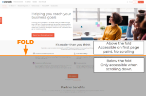
A web page fold is the point where the content cuts off, and your leads need to scroll. To make sure they see the value of your offer, don’t put your best content too low on the page. Keep important points at the top, or above the fold, so it’s easily readable.
8. TL;DR
Avoid “Too long; didn’t read” behaviors. Keep the copy short and use visuals as much as possible. Videos and images are a great way to show your product in action or showcase a satisfied customer. Don’t be an infomercial, though. Keep the content genuine.
We don’t just help with marketing, check out all our value added services with the Sherweb guide
Looking for great examples?
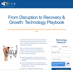
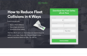
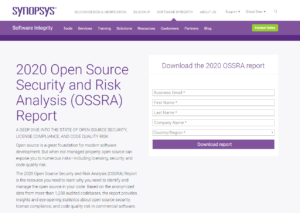
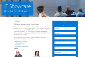
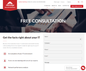
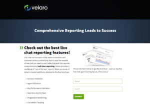
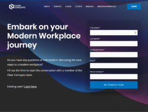
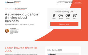
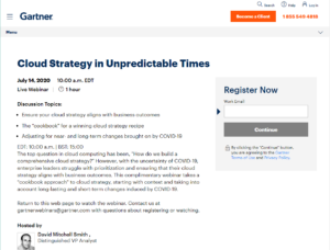
Below are great landing page examples from other MSPs or non-MSP businesses to get your creative juice flowing.
 |
 |
 |
 |
 |
 |
 |
 |
 |
Page built. What now?
Now that your page is created, you’ll need to build a link to it. You can share it on your social profiles, advertising, blogs, and more. Once you see traffic interact with your landing page, take note of a few metrics, such as:
- Pageviews or page impressions
Measures the total number of views a particular page has received - Unique visitors
Measures the total number of visitors a specific page receives. As a visitor might view a page more than once, the unique pageview and pageview number might differ significantly. - Time on page
Measures the length of time a visitor stays on the page. If the visit is too short, it implies the visitor did not stay long and did not find your page engaging enough to read. This will impact your bounce rate. - Bounce rate
The bounce rate is the rate at which a visitor leaves your page without taking any action. The lower your score, the better your page. As opposed to your school exams, keeping it below 70% is a goal to aim for. Create useful, relevant content and a good user experience to improve your bounce rate. Keep leads interested, and they will stay. Of course, if the time on page is four minutes, and they still bounce after, it simply means they got what they wanted from your page, so keep the user in mind when looking at your numbers. More info on the bounce rate is here and in this article.
- Scrolling, if applicable
If you have valuable content below the fold, you want to make sure readers get to it. Install a tool like crazy egg or hotjar to see visitor behavior. - Conversions
Measures the total amount of time a web visitor has filled a page. To calculate your page’s conversion rate, use this formula: Total conversion/total visits x 100. As you optimize your page, you want to get that number as high as possible, starting above 5% for the average of all your landing pages.
Of course, think about how the lead got there, and the KPIs around that, too. The click-through rate and impressions is where you need to look for call to actions, advertising, and links to the page.
If you’re unhappy with the conversion rates, you’ll need to do some trial and error testing and optimize your landing page. Marketing is never a set it and forget it motion! But optimizing takes much less effort than building, so you’re almost there. Start with adjusting your title, the call to action on the page, or the length of your copy. Ultimately, the design of the page can be adjusted, too, if the small optimization didn’t work. Start small, and a/b test one item at a time until you get the perfect recipe. Don’t give up.
Until our next post, in which I’ll tackle online advertising for you guys, stay engaged! Connect with us on our social platform and be a part of the conversation. Don’t forget to check out our partner benefit guide and everything Sherweb does to help you skyrocket your business.
